How to prepare a file for print
Indesign, Illustrator, Photoshop, and Quark Express are the most popular programs. All of which are capable of creating print ready pdf files. Once you master preparing a PDF properly it will save you time & money. The helpful hints below are the key things to make sure your file is ready to go to press.
If you have questions Call us: 804-359-9206 and ask for pre-press.
What Software should I use and what files should I send?
Sending us print ready PDF files is generally preferred but native software such as: InDesign, Quark, Illustrator or Photoshop are the files to send if you need help getting to the next step or if there is a chance of late corrections or changes. The file we like best is a PDF with bleeds that has been created with all of the photos, text and designs in position just the way you like it. This will lower your cost and speed the file(s) through production. PowerPoint and Word files are simply not set up to use for offset printing. These applications are not capable of embedding fonts or handling RGB color conversions to process (CMYK) for offset printing. If you only have files in one of these programs please give us a call so we can help. Remember we want to help make your printing project as easy and as high quality as possible. So let us know in advance if these are the native applications you are using.
We know it’s tough sometimes to get things exactly the way you would like. But if you can create your own PDFs you will feel more confident and can control how you want the file to look. We are here to help, so here are a few tips for preparing a PDF from an application such as INDESIGN… but these tips hold true for all programs.
CHECKLIST
SIZE: Your job should be set up at the trim size = document size. If it is changing from what we quoted it may change cost. So please let us know if something changes. Crop marks are helpful to know how images will crop and bleed. If your job is folding, check to make sure each panel is the correct size to fold properly.
FOLDING: You will need to set up your file with the correct panel sizes so that it appears the way it was intended when it is folded down. The inside panel of any folded piece needs to be slightly shorter than the other panels, usually by .0625” depending on paper thickness. If the piece has more than 3 folds you need to consider push-out and whether it will affect the appearance of the piece. Different types of folding and binding can affect panel sizes and need to be taken into consideration.
BLEEDS: Be certain to set up bleeds before sending us your disk. Bleed at least 1/8” (.125”) inch beyond crop/trim. If you have other photos, text or images that do not bleed please give us a minimum of .125” (.25 is preferred) from the cut edge of the page so no art gets cut off during trimming. If you go to the edge of your document with text or graphics, it creates a greater margin of error for both printing and
cutting your piece.
PHOTOS: All photos that will appear in print must be at least 300dpi at desired print size. Keep file names of photos and links under 30 characters. Make sure all photos have been converted to CMYK before placing them into other applications such as InDesign or Quark.
Speed through Prepress with
PDF files, Carter Remote, or our new Digital Order Form
FONTS: Send all printer and screen fonts used in the documents. Please, DO NOT send your complete library of fonts. We only need the fonts in your job. Note: Fonts generally are members of families. If you have Helvetica and Helvetica Italic and Helvetica Bold you have a family. If you try to use Helvetica and then click on B for bold to Stylize it will not work properly when we try to print or “rip” the file: We must have the Regular, Bold, and Italic fonts (When you collect for output all three will be in your fonts folder). Be aware what type of fonts you are using (Postscript, True Type/Open Type or Multi-Master). Each type of font is handled differently by the application and by the Rips. Open Type fonts are cross platform.
Embed all fonts and links from your InDesign/Quark or native file when generating PDFs. Be sure to get the actual font file and its variations (bold, italic etc.) Your client may want to change the characteristics and you will need to have the entire font family to do so.
Do not use faux fonts – be sure to use the actual font in the style you need (bold, italics, etc.)
FILES: Send only the files needed for the particular job. Include all elements of your job, even if you have embedded the art. Please, DO NOT nest folders. This will incur additional cost due to the time it takes to link your job. Please, DO NOT rename your art or use the same name for two elements. Please, DO NOT send any additional material on your disk, only what is needed to produce the particular job. Reader or printer spreads will work but they have to set up as individual pages, not two pages within one page. Facing pages can cause bleed issues if you have crossovers or if special binding will be used. (Examples: Coil or Wire-0)
COMPRESSION: Carter Printing requires you to inform us up front of any LZW compressed TIFFS. LZW compressed files are not as much an issue in ripping the file as they used to be but we need to confirm there will be no ripping issues. They may need to be changed (which incurs a charge to the customer) before a job outputs correctly. If memory is not an issue then you can save your flattened tiff without being compressed. If you have a large number of photos call us first. LZW compression can cause a large amount of chargeable file preparation time.
MICROSOFT WORD, POWERPOINT AND PUBLISHER: Up charges May Result From Using Microsoft Word, Powerpoint and Publisher files as these programs present problems such as spot colors not translating, images not imbedding properly, and font issues. Please call our Graphics Department at 804-359-9206 for assistance. Alternatively, you can email to: sales![]() carterprinting.com. Proper preparation of your files will always reduce any alteration charges.
carterprinting.com. Proper preparation of your files will always reduce any alteration charges.
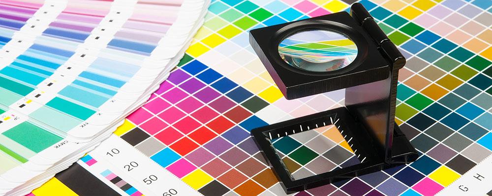
SPOT COLORS: Check your output files: Select all non-used colors and delete them from the palette.
If you have chosen a spot color to be converted to process be careful to use the appropriate color library (Pantone Color Bridge) for the closest CMYK representation of the specific spot color ink. Let us know if your job is color critical upfront.
LASER PROOFS: Send laser proofs or screen viewing PDF’s in with ALL jobs, at 100% when possible. If the job is more than one color, send color-broken lasers with files. This will show correct color breaks and show a plate for each color: Cyan, Magenta, Yellow, Black). It will also show if you have any spot colors by mistake and you can easily change to process if your job prints in four color. If using an FTP (ours or yours), Carter will produce laser proofs for you. This is especially helpful when there are no folios to specify page order during the proofing stage.
FAKING COLOR: Coloring TIFFS within Quark to produce specific color or duotone like effects is not Postscript compliant. This needs to be done within the PHOTOSHOP program.
SCANS: If scanning your images be sure they are scanned at the correct DPI or resolution of at least 1.5 times the line screen, yet 2 times is preferred. An example would be if your file is printing in 175 line screen, the DPI (or resolution) will be 350. Another consideration is the maximum density (D Max) cannot exceed 320%. In other words, the CMYK percentages cannot add up to more than 320%.
RGBs: RGB’s must be converted to CMYK in our workflow environment. If your color is from an RGB scan and you do not have the Photoshop 6.0 or newer or other photo editing programs, then an additional charge is highly likely for a printer to do this.
COLOR:
• Make sure that your entire file is set up in CMYK not RGB.
• If placing a color logo over another color area in a file be sure to use the “knock-out” setting INSTEAD
of the “over-print” setting.
• If you’ve chosen a PMS from the swatch book because you like the color, but it’s going to be built in
process, be sure the process build is the best color equivalent to match that spot.
-PANTONE COLORBRIDGE PC has the best cmyk equivalents to represent a spot color.
• Do NOT use more than 4 PMS colors in a file.
• Any areas of solid black need to be a RICH BLACK. Rich black: K – 100%, C – 40%, M – 30%, Y – 20% = 190%
of total ink density. GENERALLY: any combination of black plus under color is OK as long as the total
percentage is less than 320%. A higher percentage of cyan makes the black appear blacker, vs.a higher
yellow will make the black look green or muddy.
OTHER BASIC RULES:
• Try and give yourself a 2-color and 4-color option so you can reproduce the piece in the most cost
effective manor. Ex: Black and PMS 895 vs. a 4 color process brochure .
• When saving files be sure that all settings are Press Optimized. Take out any unused fonts, links, or colors
when you have finished designing your file. These extra pieces make your file size larger than it needs to
be and is very confusing